gone dishin'
A faux pop-up restaurant aimed to discuss the dire effects of Climate Change and the Anthropocene.
00
problem
The Gone Dishin faux activist campaign aims to draw attention to the detrimental effects of human activity on the world and animals – especially those animals that are extinct or on the verge of extinction.
solution
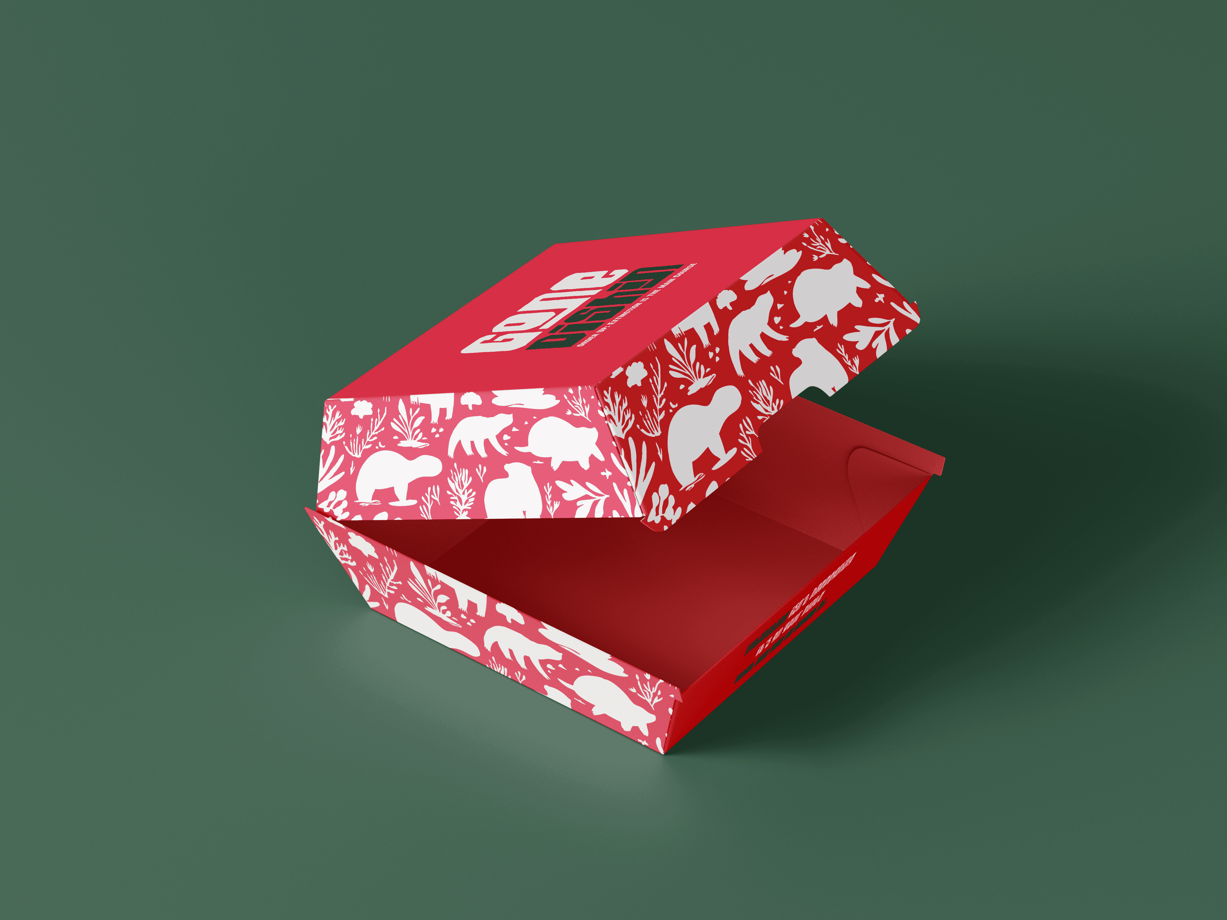
This project integrates a pop-up restaurant as a strong metaphor to make Climate Change and the Anthropocene relatable and digestible for my target audience – school students and families.
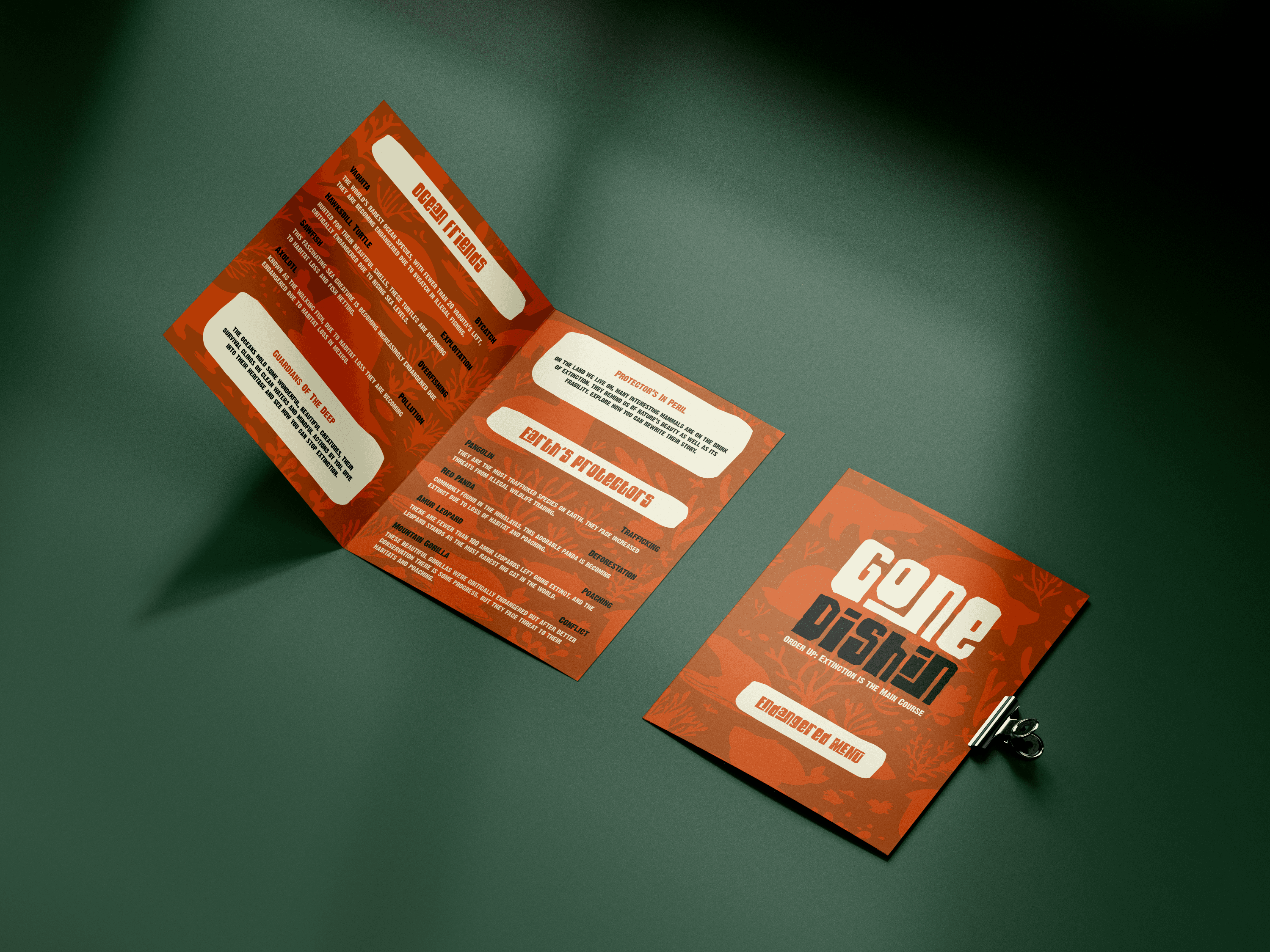
The metaphor of a restaurant menu breaks down a daunting global issue – Climate Change and the Anthropocene into digestible bits of information, allowing my target audience to process information easily and also engage with the topic in a much more approachable way. By framing extinction, and endangerment as a menu dish, the activist campaign urges viewers to consider their personal choices and actions, which strongly reinforces that humans “select” what survives and what doesn’t.
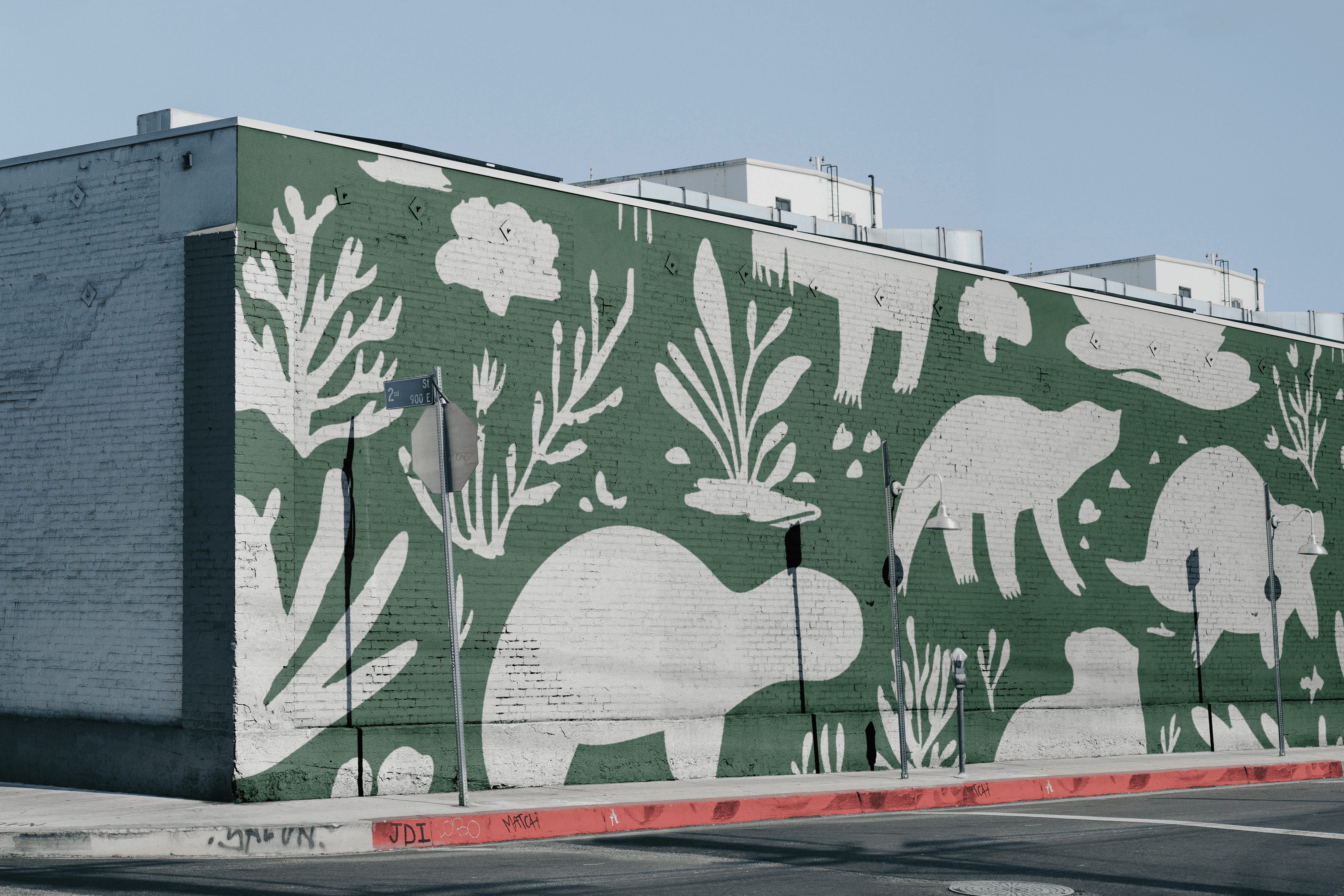
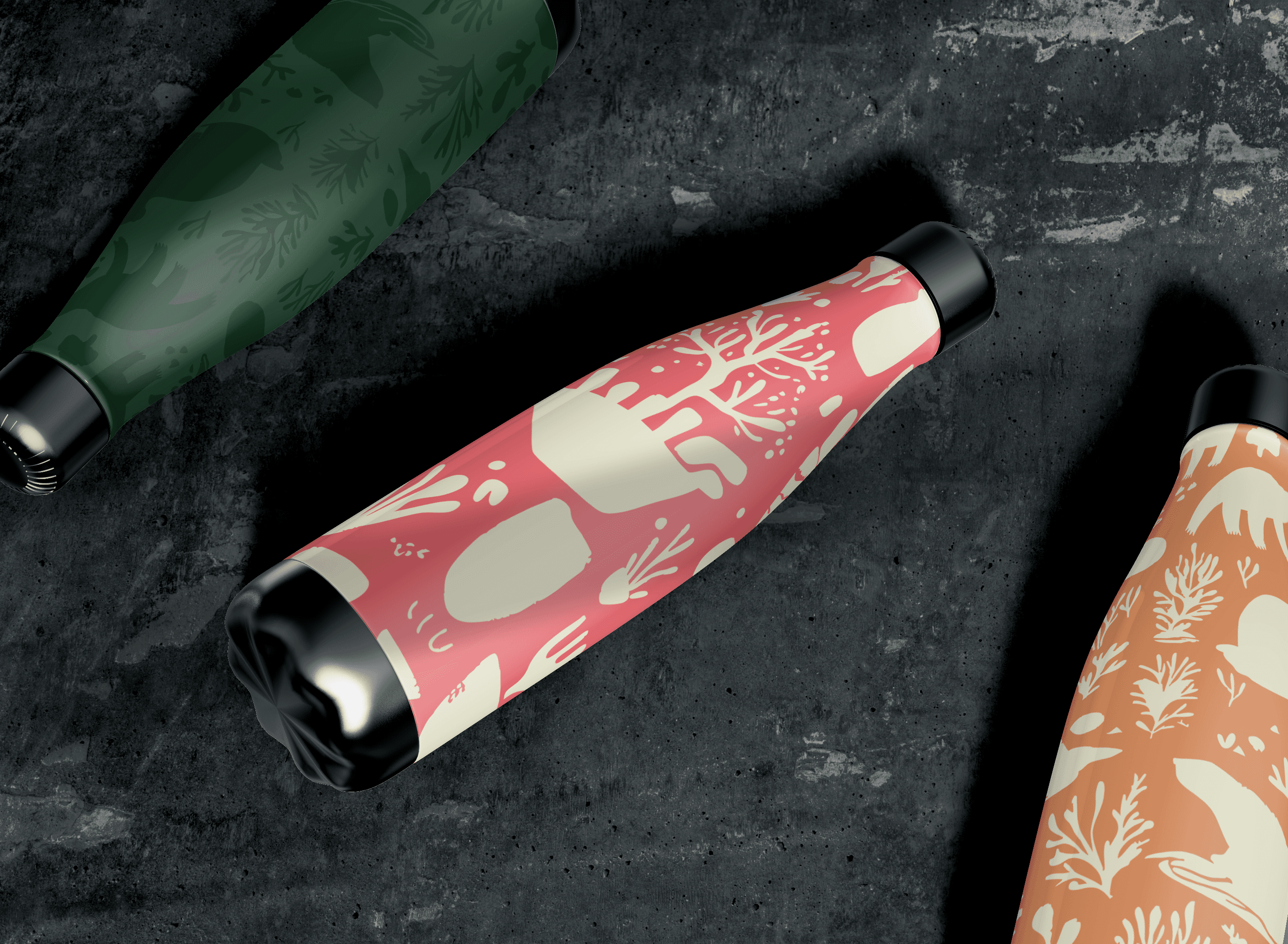
The chosen colour palette filled with hues of green, red, orange, white, and black were chosen to symbolise the theme of extinction and endangerment. Each colour portrayed a different meaning towards the campaign in its own bespoke light. The dark forest green acted as a visual metaphor for these animals’ natural habitats in the forest. This dark green hue immediately anchors the viewer in intense themes of ecology and conservation whilst also providing a sombre feeling reflecting the campaign’s intense messaging about biodiversity loss and fragility. Both green colours contrast heavily towards the alarming colour of red, making the campaign feel urgent and vital.
Nature’s green hues tie back to the sense of renewal and hope, evenly balancing the campaign’s voice and tone. Furthermore, the bold red colour can symbolise a sense of urgency and danger, creating an emotional cue for audiences to act upon this global issue. It’s used discreetly to highlight key text or features within the campaign ensuring it commands attention without making the design overwhelming and menacing.
As aforementioned, the colour red evokes a theme of a visceral, and immediate response similar to warning signs or emergency signals reinforcing the critical nature of the campaign’s message. The bone white colour almost acts as the idea of extinction and death, it ties intensely with the skeletal system of the extinct lost due to the Anthropocene. It gives the campaign a clean and minimal edge, allowing key elements to stand out. The blunt use of bone white mirrors the “emptiness” left by extinct animals, strengthening the campaign’s solemn undertone.
year
2025
timeframe
25 days
tools
Adobe Creative Cloud
category
Branding and Identity
01
02
03